
PROBLEM CONTEXT
I noticed people new to the US credit system struggle to get their first new credit card and start their credit journey.
This is a net loss to the users as well as business (credit card issuers).
I designed a solution that benefits both users and business.

ROLE
Solo Designer.
End-to-End Product Design.
DURATION
2 months
FINAL SOLUTION
Credito is an app designed to help people get their first credit card and start their credit journey in the US.
OUTCOME
When I presented the final solution in front of users…

Understanding user pain points ( Full details here)

Envisioning a future user journey


Explorations to address Dropoff
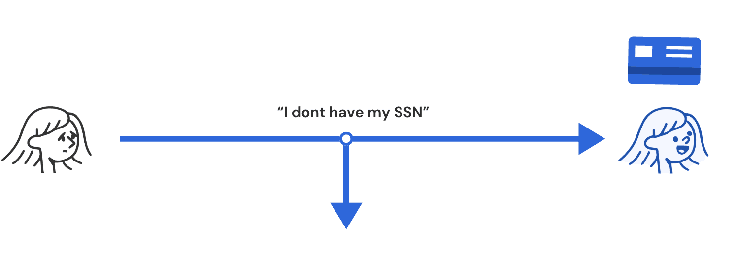
Skip SSN (for now)

Pro
Get all other details while we have the user.
More likely to value our app after they have shared some details
Con
Initial excitement -> disappointment -> losing trust
Inline instructions

Pro
User has step by step instructions
Con
UI Feels crowded no matter what the placement is.
UI will feel intrusive for people who already have their SSN
Embed video

Pro
Video is well received.
Users pay more attention
Con
Users have to rewatch video to note things down
UI will feel intrusive for people who already have their SSN
Combining the best features
A flow which works for both a user with and without SSN.

Nudging the user with notifications/ email to the exact next step they need to take. Reduce dropoff.

Explorations to address minimize friction / time to value
Users see value at 1 key moment -> When they are successfully approved for a card.
Only if there was a business or technical constraint, I collected the data before providing value.
Otherwise it was pushed off until after user sees value.

Combining the best features
A flow which works for both a user with and without SSN.

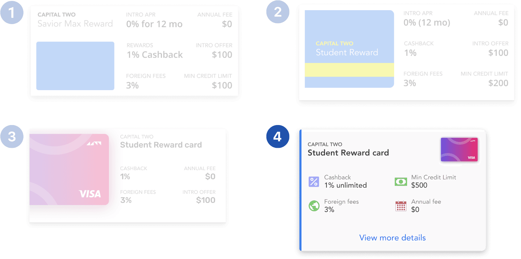
Exploring presenting credit card options
The primary goal here is to get the user to pick a card.
I went with option 4 because it represented the right balance of visual interest and functionality.

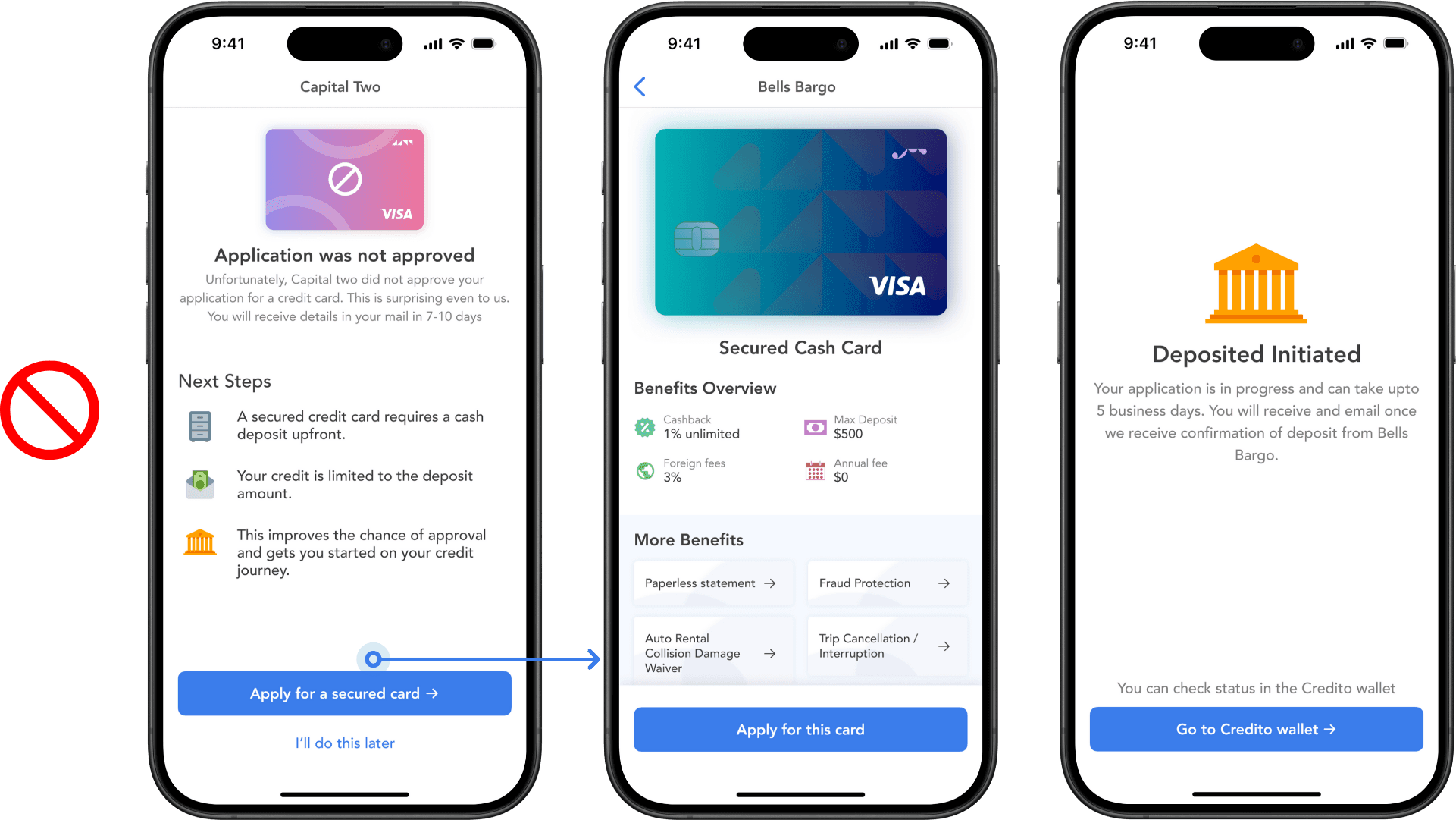
Handling moment of truth experience
Elevate peak moments - makes it memorable for user.
Guide the user towards activation - In this case it is adding card to wallet.
In case application is rejected, we handle it gracefully redirecting to our partner bank.
Our partner bank offers a secured credit card.
By gracefully guiding them towards it, we create a win-win situation for users and business.

Multiple states
When the user hasn't and has established credit history.
The banner stands out visually to inform user why they dont see numbers and what they need to do next

All "in progress" indicators stand out visually in the UI

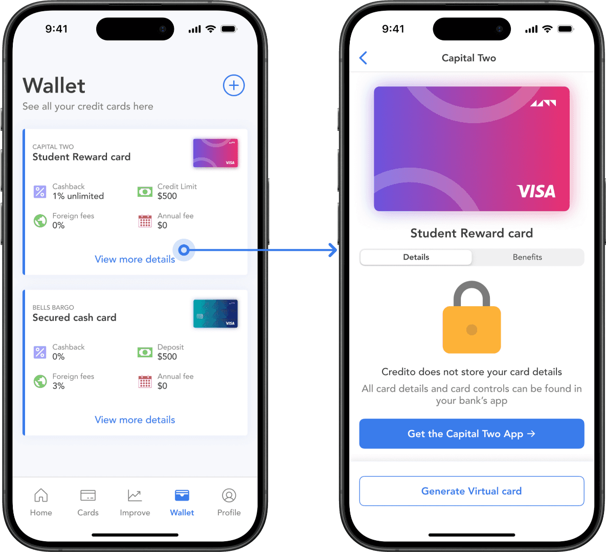
Monetization
Several ways to monetize throughout the app.
Here is one example. The App actually cannot store details of the virtual credit card.
I turn this technical/ legal constratint into a revenue source for business by bringing more customers to our partner bank's app.


